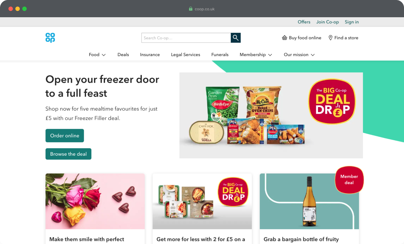
After about 18 months at Co-op, mainly working on our Experience Library design system, I joined the team who look after our main website, coop.co.uk.
The team’s mission was to
“direct high-quality traffic to our food stores and online journeys to drive growth of our Co-op”
The team was funded as a ‘run’ team, and was composed of several software and platform engineers working diligently to keep Co-op’s many web services running.
My role as a designer was to drive ‘change’ where possible. Prior to my move, other designers had been loaned from other areas of the wider Food team, but hadn’t been able to give dedicated focus to some much needed enhancements required on coop.co.uk.

The navigation was one of these areas.
Co-op, as you might know, is a unique business. Due to its community-focused and member-owned nature, it has a range of disparate ‘arms’ intended to serve various aspects of society. Food retailing. Funeral services. General insurance. Legal services.
So it made sense to list all of these in the main navigation right?
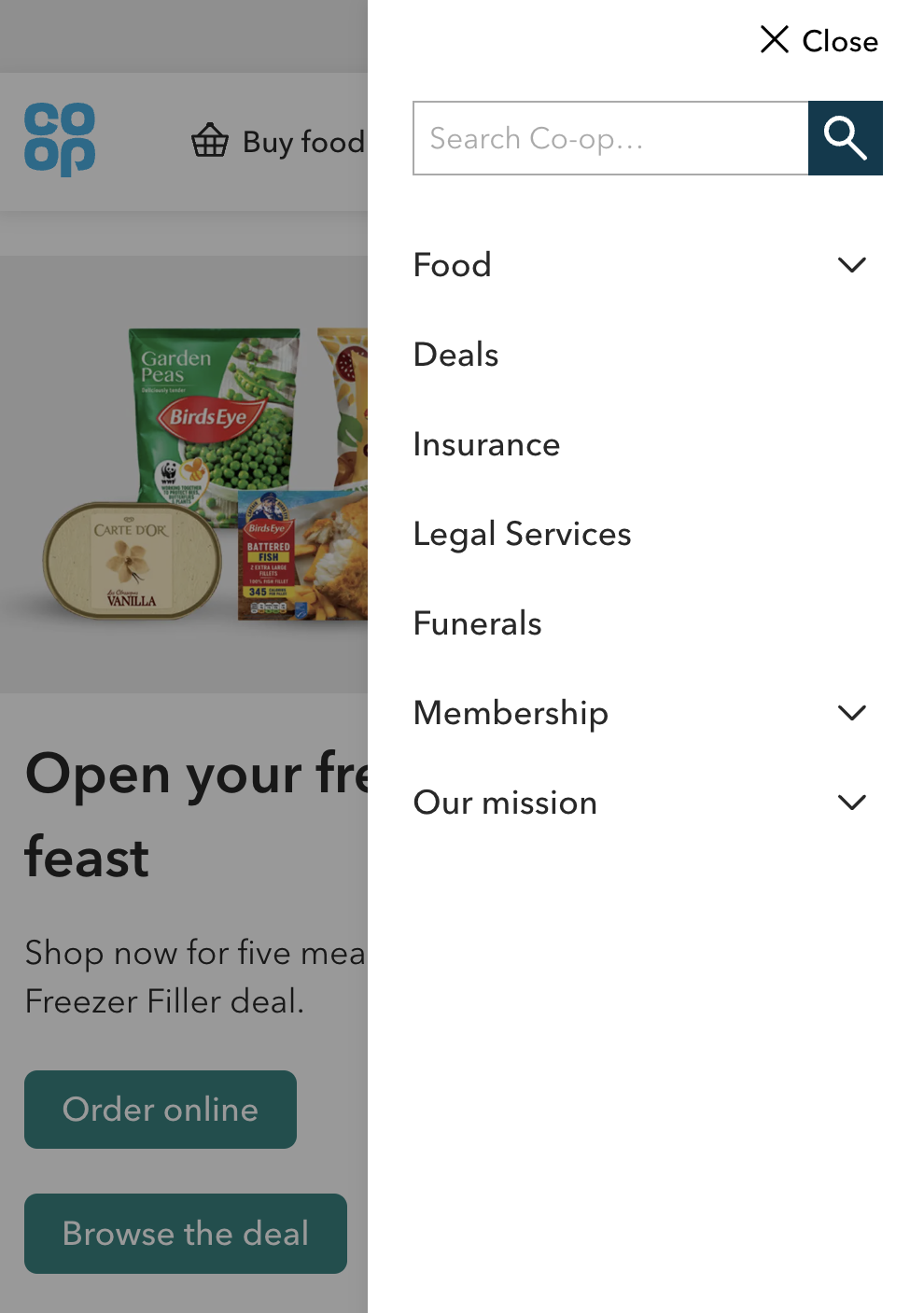
Well, not exactly.
Co-op’s services are equally important, but that doesn’t necessarily mean they should have equal prominence on the website.
How often will you need a funeral service? Hopefully not too many times in a lifetime.
How often do you need insurance? Maybe once or twice a year?
But how often might you browse or order food? Well, depends how thorough your last big shop was.
The problem was, we weren’t tracking the information we needed to establish whether we were serving key missions.
So users were just presented with what we told them about Co-op.
To improve the quality of traffic, we needed to know what users actually were interested in.
And knowing this would tell us whether we needed to change this old navigation.
So the brief became a question of how might we…
establish a navigation for Coop.co.uk which more prominently features the most popular user journeys
and better performs against our KPIs (directing high quality traffic to the online shop)
The first thing I needed to discover was simply how people were using the website.
With the help of our data analyst, I gathered data from the year to date (August 2022) on how people used coop.co.uk.
I looked at clickthroughs from both the top level of the navigation, and the sub-navigation, across both desktop and mobile (where most of our traffic came from).
The results were stark.
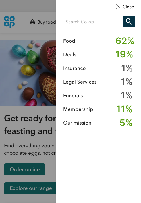
When people came to coop.co.uk to be directed to the Co-op-related service they required, overwhelmingly this service was related to Food.
Google Analytics showed that traffic to other business units was incredibly low
Within Food, ‘Buy food online’ (the first link) accounted for 54% of clicks
Among the most popular pages in the sub-navigation was food-related marketing content like ‘Recipes’ and ‘Summer’, which had potential e-commerce traffic but were hard to find.
From these findings, I deduced that:
users didn’t need the business units in the main navigation - they could be moved elsewhere
intent to buy online was high, so this needed to be prioritised
elevating food-related marketing content would better serve user needs
Next, I needed to test these assumptions with users.
To test this concept of deprioritising other business units and promoting food, I fashioned a simple test design. This was to:
a) check that my reasoning was sound before investing more time on design and development
b) give potentially unsure stakeholders a gentle, low-stakes test to prove my hypothesis
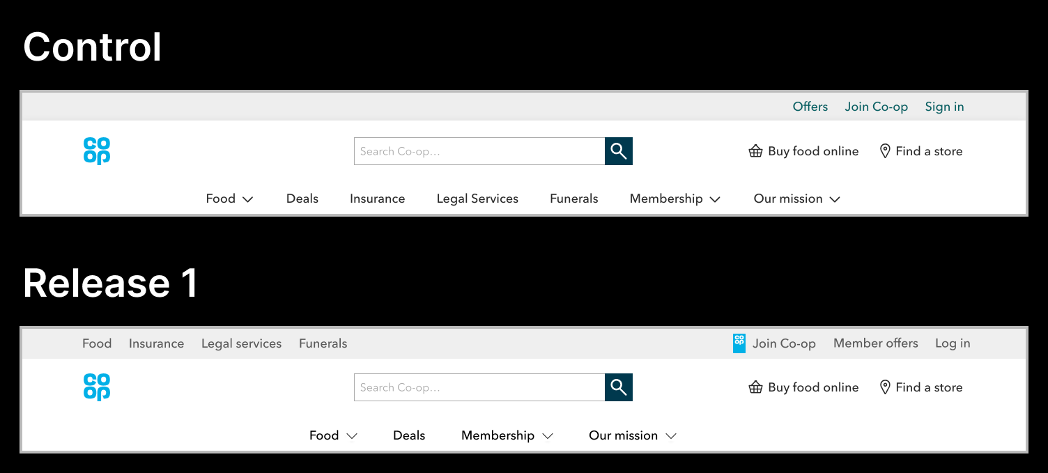
With the help of the CRO team, who built the test in Adobe Target, we got this live and monitored the results.
Views to the other business units were not impacted by the move to a new ‘global header’, and the reduced distraction of multiple elements, actually increased views to some of the other navigation items on desktop.
After presenting the outcomes back to stakeholders, I had allayed fears of change and further testing, and I had shown to myself that my early reasoning at least was sound.
Time to push things further and design a new navigation to be tested with users.
With the business units moved, I went back to the main findings from the initial data.
intent to buy online was high, so this needed to be prioritised
elevating food-related marketing content would better serve user needs
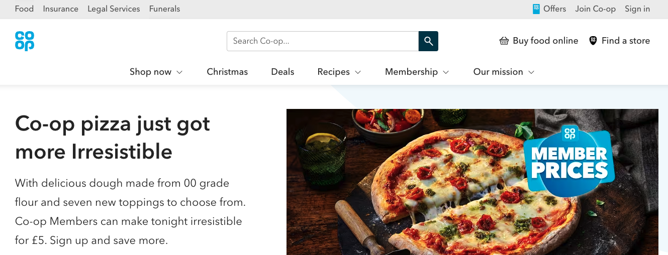
So the new navigation needed to have prominent shop links, and food-related marketing content.
I selected ‘recipes’, ‘summer’ and ‘blog’ for inclusion, in a new food-focused navigation.
Food became ‘shop now’, to make the online shop link more prominent.
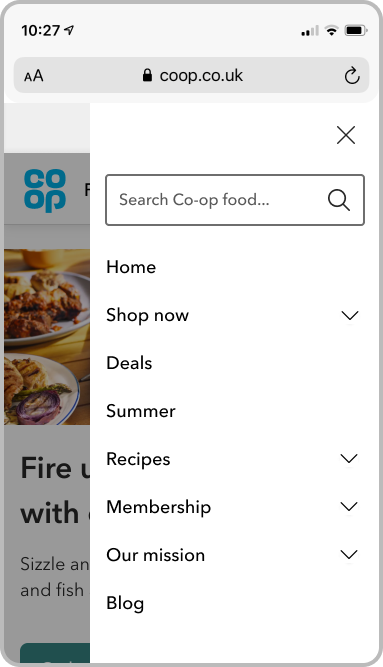
In the sub navigation, I’d noticed in the initial data that there were several unused links in the messy range of options. So I decided to apply some content design principles here and organise the information.
As we would with any piece of content, I:
added a header and sub-header to provide a clear call to action
added an action button, so users could quickly do the most popular action ‘order online’
under ‘shop now’, I sorted the other links into 3 columns, so they were easier to scan (stackable on mobile)
under the other headings, I simply maintained the call to action section, and one column of links
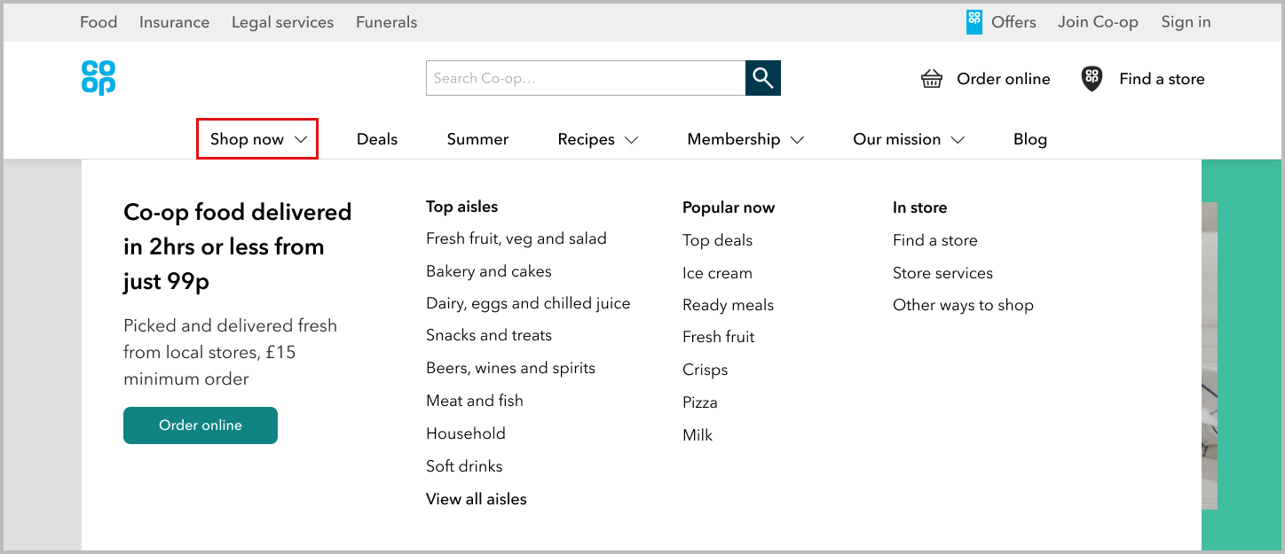
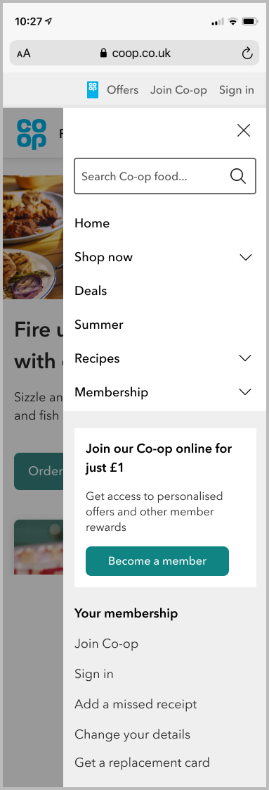
The new food-focused navigation was ready to test.
Again, working with the CRO team, we built and ran the test as a multi-variant test, showing the control and the variant 50/50 to users.
The hypothesis was proven right.
The intent to buy was reflected in the fact that ‘shop now’ was the most visited item on the navigation, and the ‘order online’ button the most visited in the sub navigation
Views to ‘recipes’ were massively up by 350% suggesting that the previously buried food marketing items were successful
But it wasn’t all success.
Despite a reorganised and reduced number of items in the sub-navigation, very little was being clicked on under the shop menu.
The ‘order online’ CTA button and the ‘view all aisles’ shortcut was being visited, along with some of the most popular aisle types. But columns 2 and 3 had little to no clicks.

I realised I’d still been looking at the site from a desktop-first perspective and needed to change.
We needed a simplified navigation before we could implement this properly.
The big green sub navigation button had proven to cut through a lot of the noise - ‘send me to the shop’
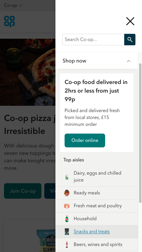
So that had to remain, supplemented by just one row of links to the most popular area of the site.
I also did some competitor analysis, to cast the net wider for potential ideas.
Straying away from other grocery sites, I looked at retailers like ASOS, who included product image icons within the navigation.
So I mocked up one design with a simple list of our most popular shopping ‘aisles’, and a design using product imagery icons.
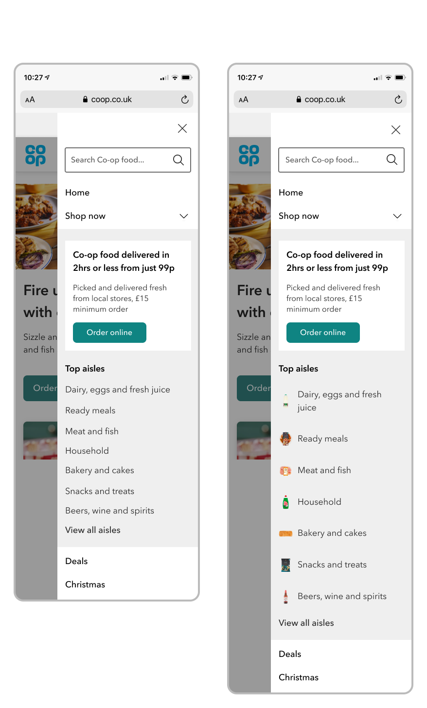
I suggested that we run this as a multi-variant test to test the durability of the reduced navigation, and to test the effect of visual stimulation now that the noise had been removed.
We ran this as a 33% split (control, variant 1 with icons, variant 2 without icons) on the homepage for 31 days.
Visits to shop had increased on both test variants, but whereas variant 1 saw conversion rate increase, variant 2 saw an increase in the conversion rate (projected at £277,000 over the course of a year)
Views to recipes were up by 1500% having moved that marketing information to the main navigation (prompting a potential new source of referral traffic to our online shop)
Huge increase in clicks in the sub-navigation, not only to the button and the ‘view all aisles’ link, but also to the aisle listings compared with the dozens of links from before
I recommended that we implement variant 2 as our new baseline navigation, and continue to iterate
I also proposed that we look at onward journeys from the navigation to shop
The quick test of concept was a worthwhile exercise which gave myself and stakeholders the confidence in improving journeys. It didn’t require much design, just implementation, and quickly got significant results.
This allowed design to take place with more insight, which resulted in a more successful test. It wasn’t wholly successful though, and the need to iterate was a welcome reminder of designing solutions that were mobile-first. Once I took that into account, the test was more successful and ready to implement.
Looking into different industries resulted in a winning combination which may not have been achieved by simply echoing competitors. The competitor analysis yielded successful results, showing the value in iteration.